Meta-Analysis & Levels of Evidence
A high-yield Step 1 walkthrough of meta-analysis as the apex of the evidence pyramid: how to read forest and funnel plots, interpret heterogeneity (I²) and publication bias, and rank study designs by level of evidence.
Overview: Meta-Analysis & the Evidence Pyramid
A meta-analysis statistically pools results from multiple independent studies (ideally RCTs) that ask the same question into a single summary estimate. Together with the systematic review it is built on, it sits at the top of the evidence pyramid. Pooling data increases statistical power and precision (narrower confidence intervals) and can reconcile conflicting small trials.
But a meta-analysis is only as trustworthy as the studies fed into it — garbage in, garbage out — and is threatened by publication bias and between-study heterogeneity. For Step 1, master three tasks: reading a forest plot, recognizing a funnel plot (publication bias), and ranking study designs by level of evidence.
- Meta-analysis = quantitative pooling of studies; systematic review = structured synthesis that may or may not include a meta-analysis
- Main benefits: ↑ power and ↑ precision (narrower CI), plus a more generalizable estimate
- Forest plot shows each study's effect + the pooled result; funnel plot screens for publication bias
- Heterogeneity = how much study results differ; quantified by I² (>50% substantial) and Cochran's Q
- Fixed-effects model assumes one true effect; random-effects model allows effects to vary (use when heterogeneity is present)
- Greatest threat: publication bias — significant/positive trials are preferentially published, inflating the pooled effect
Hierarchy of Evidence (Pyramid)
| Rank | Study design | Key point |
|---|---|---|
| Highest | Systematic review / meta-analysis of RCTs | Pooled data, least bias |
| ↑ | Randomized controlled trial (RCT) | Randomization limits confounding |
| Cohort study | Prospective; yields incidence & RR | |
| Case-control study | Retrospective; yields OR | |
| Case series / case report | No comparison group | |
| Lowest | Expert opinion / editorial | Anecdotal |
Reading a Forest Plot
On a forest plot, each row is one study: the box is its point estimate (box size ∝ study weight, i.e., precision) and the horizontal line is its 95% CI. The central vertical line is the line of no effect — 1.0 for ratio measures (OR/RR/HR) or 0 for differences (mean or risk difference). The diamond at the bottom is the pooled estimate; its width is the pooled 95% CI.
Key rule: if a study's CI — or the diamond — crosses the line of no effect, that result is not statistically significant. A diamond lying entirely left of 1.0 for a treatment OR/RR means the intervention reduces the outcome; entirely right means it increases it.
Separately, a funnel plot is used to screen the same pooled studies for publication bias (detailed below).

Stem: A meta-analysis of 12 RCTs tests a new antiplatelet drug for recurrent stroke. The forest plot shows a pooled relative risk 0.82 (95% CI 0.71–0.94), with the diamond entirely left of 1.0. I² = 15%.
Interpretation / next step: The pooled CI does not cross 1.0, so the effect is statistically significant — the drug cuts recurrent stroke risk by ~18% (relative risk reduction = 1 − 0.82). Low I² (15%) means minimal heterogeneity, so a fixed-effects model fits and the pooled estimate is reliable. Before accepting it, examine the funnel plot for publication bias.
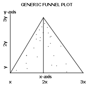
Stem: Plotting effect size against sample size for 20 antidepressant trials yields an asymmetric funnel: large trials cluster near no effect, several small trials show large benefit, and there is a gap where small "no-benefit" studies should be.
Interpretation / next step: This funnel-plot asymmetry is the classic sign of publication bias — small negative trials went unpublished, so the pooled estimate overstates benefit. Next: quantify the asymmetry (Egger's test), search trial registries / grey literature, and consider statistical correction (e.g., trim-and-fill).
Forest Plot vs Funnel Plot
| Feature | Forest plot | Funnel plot |
|---|---|---|
| Purpose | Display individual + pooled effects | Detect publication bias |
| X-axis | Effect size (OR/RR/MD) | Effect size |
| Y-axis | Individual studies (rows) | Study precision / sample size |
| Key marks | Boxes (weight), CIs, diamond = pooled | Dots = studies; expected symmetric funnel |
| Red flag | CI crosses line of no effect → NS | Asymmetry → missing small negative trials |
PICO — the framework a systematic review uses to build its question (and what a clean forest plot answers):
- P — Patient / Population
- I — Intervention
- C — Comparison (control)
- O — Outcome
Pool only studies that match on PICO — mismatched populations or outcomes are a hidden source of heterogeneity.
Practice Biostatistics now
Board-style questions, spaced-repetition flashcards, and a Socratic AI tutor — free to start.